


LE PROF. LUCAS — A Marca
PT
Le prof. Lucas, em português, "o professor Lucas", é uma marca afetiva, que nasceu da vontade genuína de se conectar com colegas e do anseio por alunos fiéis.
Com o propósito de impactar positivamente as pessoas através de um trabalho autêntico, realista e criativo, a marca tem a missão de motivar o interesse pelo aprendizado da língua e da cultura francófona. Aqui, o ensino de francês leva em conta a diversidade cultural presente nas várias regiões onde esse idioma é falado.
EN
Le prof. Lucas, in English, "The teacher Lucas" is an affectionate brand born from the genuine desire to connect with colleagues and the desire for loyal students.
With the purpose of positively impacting people through authentic, realistic and creative work, the brand's mission is to motivate interest in learning the French-speaking language and culture. Here, French teaching values the cultural diversity present in the various regions where this language is spoken.

PAINEL SEMÂNTICO


PT
Valorizando os traços da diagramação francesa, principalmente no cinema, na artes e na fotografia, a construção da marca possui o design gráfico francês como fonte de inspiração principal.
EN
Valuing the features of French layout especially in cinema, arts and photography, the construction of the brand uses French graphic design as its main source of inspiration.


PT
A logotipo tem seu foco principal na pronúncia, com elementos que fazem uma brincadeira com a gestalt (em relação ao rosto), ao mesmo tempo que nos lembra constantemente sobre o conhecimento de uma nova língua.
EN
The logo has its main focus on pronunciation, with elements that plays with the gestalt (in relation to the face), while constantly reminding us about the knowledge of a new language.

EN
The letter "L" represents the union of languages in the pronunciation of the article "Le" and in the beginning of the speech of the name "Lucas", since the two are quite similar.
The quotation marks represents communication.
The circle represents anatomy of our mouth when pronouncing the article "Le".

PT
Esta seria a anatomia real de nossa boca ao pronuciar o artigo francês "Le".
EN
This would be the real anatomy of our mouth when pronucing the French article "Le".


EN
Classical typography that concerns the writing created by Claude Garamond,
in the "Golden Age of French Typography."

EN
Without serif, the Novecento adds in the modern visual of the brand. Perfect combination for the classic Garamond serif.

PT
A paleta de cores foi inspirada em belas fotografias de lugares da França, fazendo jus a forte inspiração na fotografia que o design gráfico do país possui.
O azul céu é a cor principal da marca, e traz com ela os sentimentos de amizade, confiança e criatividade.
O creme representa os aspectos da calma, da paciência e da estabilidade, sendo valores imprescindíveis quando estamos falando de uma marca que busca ensinar e se conectar com pessoas.
Os tons terroros e escuros que passam pelo marrom, vermelho, bordô e azul marinho representam a inovação, a coragem e a estabilidade.
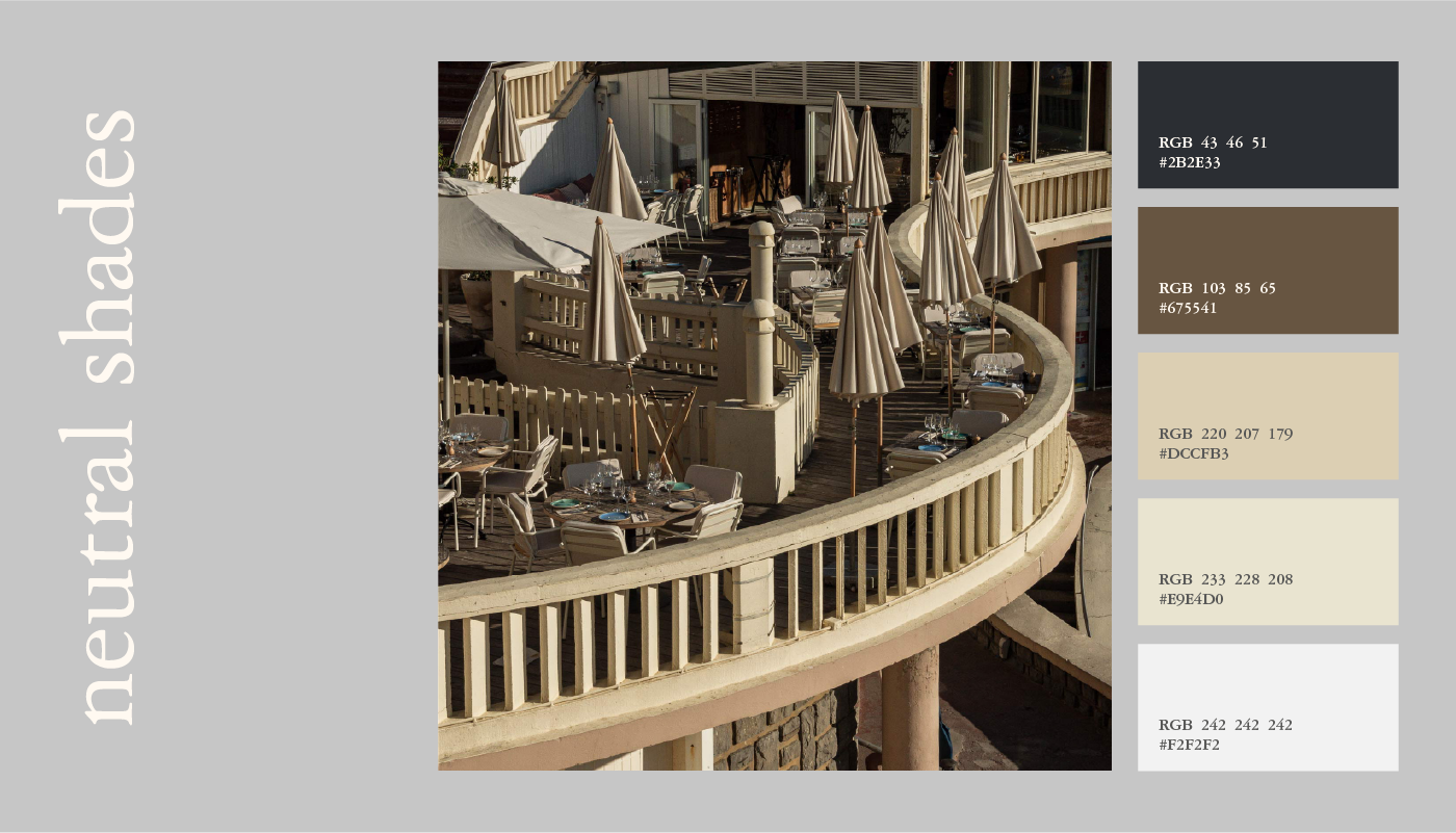
Os tons neutros foram pensados para dar ao usuário uma versatilidade maior na hora de combinar as cores, servindo como um grande apoio, sem precisar sair dos padrões visuais da marca.
EN
The color palette was inspired by beautiful photographs of places in France, living up to the strong inspiration in the photography that the country’s graphic design has.
Sky blue is the main color of the brand, and brings with it the feelings of friendship, confidence and creativity.
The cream represents the aspects of calm, patience and stability, being essential values when we are talking about a brand that seeks to teach and connect with people.
The earthy and dark tones that pass through brown, red, burgundy and navy blue represent innovation, courage and stability.
The neutral shades were designed to give the user a biggest versatility to match the original colors, serving as a great support without leaving the visual standards of the brand.


PT
Os desenhos feitos à mão representam um lado humano e criativo, e buscam representar tudo o que a marca tem para oferecer: cultura, descobertas, aprendizado e comunicação.
A autenticidade é um dos maiores valores aqui, buscando sempre inovar e trazer a ideia de que a língua francesa não se resume apenas à França. Quando falamos de Le Prof. Lucas, queremos lembrar de que aprender um novo idioma é, também, aprender sobre uma nova cultura.
A autenticidade é um dos maiores valores aqui, buscando sempre inovar e trazer a ideia de que a língua francesa não se resume apenas à França. Quando falamos de Le Prof. Lucas, queremos lembrar de que aprender um novo idioma é, também, aprender sobre uma nova cultura.
EN
The handmade draws brings a human and creative side and represents everything the brand has to offer: culture, discoveries, learning and communication.
Authenticity is one of the greatest values here, always seeking to innovate and bring the idea that the French language is not just about France. When we talk about Le Prof. Lucas we want to remember that learning a new language is also learning about a new culture.
Authenticity is one of the greatest values here, always seeking to innovate and bring the idea that the French language is not just about France. When we talk about Le Prof. Lucas we want to remember that learning a new language is also learning about a new culture.


EN
ARCHETYPE —
CAREGIVER/ HELPFUL
CREATIVE
The junction of the helpful archetype with the creator archetype has a very great potential for growth, since the helpful obtains the desire to always be in the role of auxiliary, and the creative, besides being constantly sharing their knowledge, does not rest until they reach their goals.


